UNLV’s new logo quickly met with harsh reviews


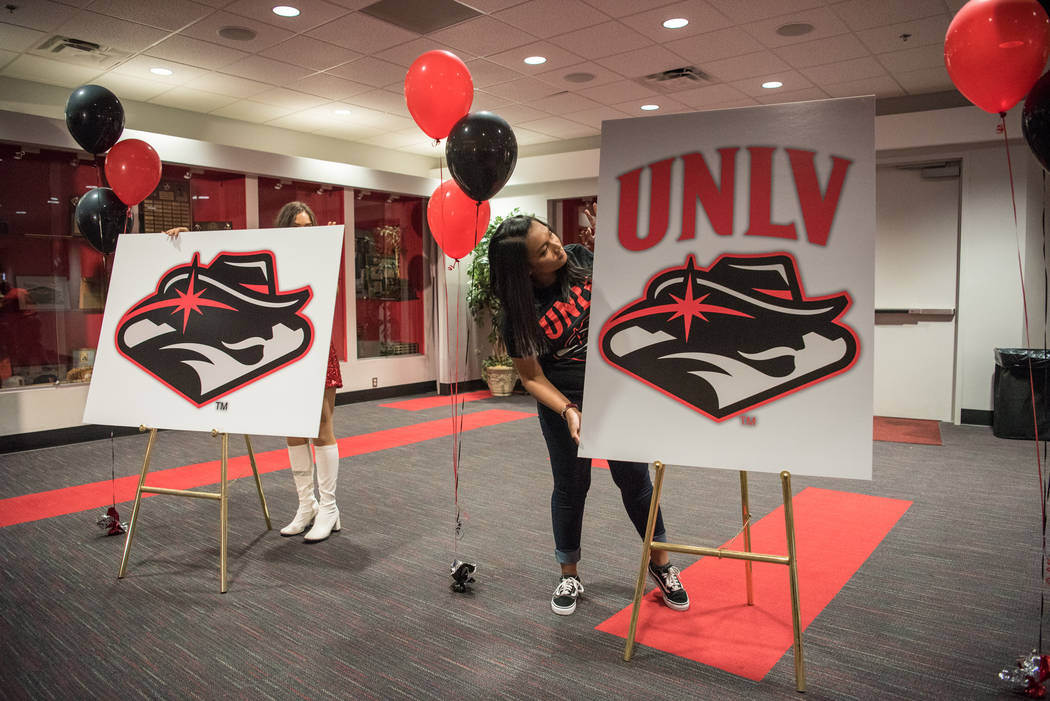

UNLV’s first logo overhaul in 11 years was met by harsh reviews within minutes of its unveiling Wednesday.
Social media was especially unforgiving as some struggled to understand the new look.
“What is it?????” tweeted Michele Correa. “It kind of looks like a folded pile of clothes with a cowboy hat.”
What is it????? It kind of looks like a folded pile of clothes with a cowboy hat.
— Michele Correa (@LasVegasMichele) June 28, 2017
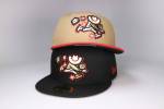
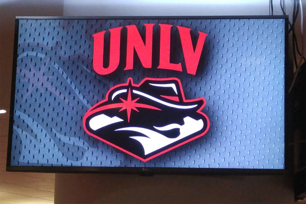
The updated logo gave the Hey Reb! mountain man a major makeover while adding a nod to Las Vegas and the surrounding area. The mustache on Hey Reb! was given a trim, and the logo now includes the twinkling star associated with the famous “Welcome to Fabulous Las Vegas” sign south of the Strip. A silhouette of neighboring mountains completes the redesign.
“I wanted something modern and strong, and I think that it conveys that,” UNLV president Len Jessup said after the unveiling in the Si Redd Room at the Thomas &Mack Center. “I like the way they also captured the energy and enthusiasm of the university. It’s got that look like it’s moving forward in the way the wind’s blowing the bandana. The big surprise for me was the Las Vegas sign. That came out of the committee and design firm, and I think it was a really nice addition.”
UNLV outsourced the project to Adrenalin, a design firm based in Denver. The university paid close to $50,000 raised through private donations for the design.
This is the first update of the logo since 2006. Hey Reb! made its debut in 1982, and other changes were made in 1997 and 2006.
Logo detractors unloaded a barrage of criticisms and quips at a design they found difficult to visualize.
“Famous silhouette logos — the NBA has Jerry West, MLB has Harmon Killebrew, and now UNLV has Sam Elliott,” wrote Thomas Wilson on Twitter.
Famous silhouette logos--the NBA has Jerry West, MLB has Harmon Killebrew, and now UNLV has Sam Elliott.
— Thomas Wilson (@Brocktune3100) June 28, 2017
Logo defenders were few, but one was ex-basketball star Greg Anthony, who tweeted a thumbs up.
I think https://t.co/HDowczufYL
— Greg Anthony (@GregAnthony50) June 28, 2017
Jessup said the decision was made more than a year ago to make changes to the logo, and “the work began last September.”
Dan Price, president of Adrenalin, said about 200 “concepts” were considered. The firm also relied on a UNLV committee formed by various university personnel as well as students.
“At the end of the day, we came up with a mark that I’m extremely proud of,” Price said. “I hope the committee, and I know they are, are extremely proud of it.
“We wanted to make sure this was truly unique to the university, so when we went to the research, there were certain things that came to the surface. People were looking for something that was a little more modern, something that was better representative of the region, something that had a little more energy.”
![]()
New UNLV athletic director Desiree Reed-Francois wasn’t involved in the process but said she liked the new look.
“Any time we have a chance to embrace this dynamic region, I’m excited about that,” Reed-Francois said.
Contact Mark Anderson at manderson@reviewjournal.com. Follow @markanderson65 on Twitter.
UNLV coaches weigh in
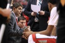
Men's basketball coach Marvin Menzies: "I love the modern look it has. It's fresh and new, it keeps its history but with a modern flair, and my first instinct is that my players will love it."
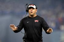
Football coach Tony Sanchez: "The university did a great job of making the mark more vibrant and incorporating unique concepts of Las Vegas and Hey Reb! I think it's so important that any time you're going to make changes that you really honor the path."
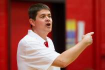
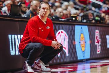
Women's basketball coach Kathy Olivier: "The new mark connects Las Vegas with Hey Reb! which is really good for the university and the community. The mark is very unique. It's modern and is moving forward in the direction our campus is going."
Related
UNLV fans react to the new spirit logo