CATTLE BRANDS SERIOUS BUSINESS
When the Southern Nevada Water Authority bought the El Tejon ranch in White Pine County last May, the agency also acquired some livestock and an unusual problem.
Suddenly, the wholesale water supplier for the Las Vegas Valley needed its own cattle brand.
The design job fell to senior public information coordinator Lisa Riess and graphic artist Cathy Leece.
"It was absolutely the most unusual thing I have been asked to do," says Riess, an eight-year employee of the water authority.
Since neither of them knew the first thing about branding, they began by hitting the books.
What they discovered was a rich Nevada tradition dating back well over a century, one with its own complex set of rules and conventions.
It was a little like learning a new language, one Riess compares to Morse code or hieroglyphics, with letters and symbols that contain entire phrases if you know how to unlock them.
"This is not the typical brand you’re used to in marketing," she says. "This was an entirely new subculture for us."
In other words, the authority could not simply burn a version of its water-droplet logo into the hides of its newly acquired cattle and sheep. Developing the brand had to be a "very careful, very deliberate" process, says Brandon Humphries, the authority’s ranch manager in White Pine County.
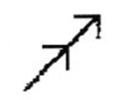
Riess and Leece knew going in that their design would have to be unique, so it wouldn’t be confused with any other brand on file in Nevada. They didn’t realize that would mean paging through the state’s brand book, a 600-page tome crammed with about 4,000 different symbols.
"I would liken it to a copyright search," Riess says.
They also had to consider the landscape in which the livestock roam, since tradition dictates that a brand be "symbolic of the land it represents," Riess says.
Humphries had an additional requirement. He needed the brand to be easy to identify from a distance, but not so easy as to "rub it into people’s faces" that the Southern Nevada Water Authority now owns livestock in the area. After all, Las Vegas water officials aren’t exactly popular in White Pine County, what with their plans to export billions of gallons of groundwater from the area.
Finally, Riess and Leece had to consider the technical constraints of brand design, namely that the symbol they selected must be easily rendered in iron. And in the interest of being humane, they had to avoid the use of multiple symbols and enclosed spaces in their design that might cause painful "hot spots" in the finished brand.
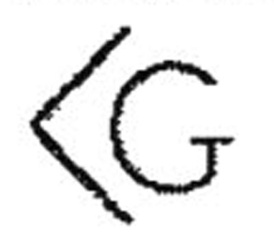
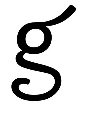
The process took about nine months and involved dozens of drafts, including one that translated to "small fancy g."
Riess says the water authority’s administrative team helped pick the final version, and the Nevada Department of Agriculture’s Division of Livestock Identification gave its approval last October after a few weeks of review.
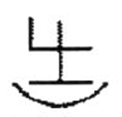
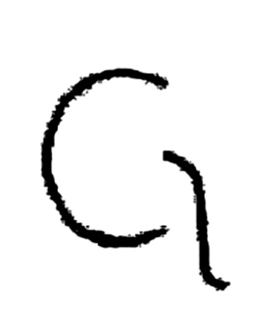
The authority’s brand looks like an uppercase G with a waterfall tumbling out of it. And for good reason. The symbol literally translates to "falling water G."
The G stands for Great Basin Ranch, the name under which the water authority operates the more than 23,000 acres it has acquired in White Pine County’s Spring Valley since 2006.
"A brand to us is a literal brand, but it still represents the company," Humphries explains.
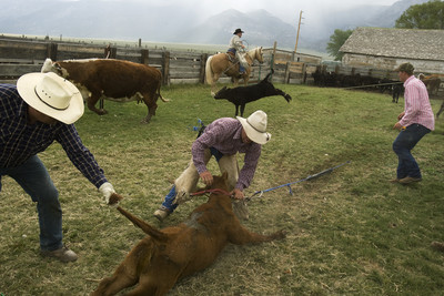
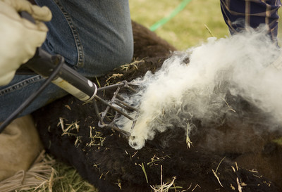
The new brand was seared onto the right hip of about 1,500 calves in late May and June.
Asked how she feels about that, Riess says she has no moral objections to the practice of branding or cattle ranching in general. She used to be a vegetarian, but now she enjoys a good steak once in a while.
That’s where she draws the line, though.
Riess says she has no interest in actually burning her "falling water G" onto the side of a live animal.
"I’ll leave that to the professionals," she says.
Contact reporter Henry Brean at hbrean@reviewjournal.com or 702-383-0350.