
Can you spot what’s different about Google’s logo?


Google made a change to its logo recently, and it’s so subtle you probably missed it.
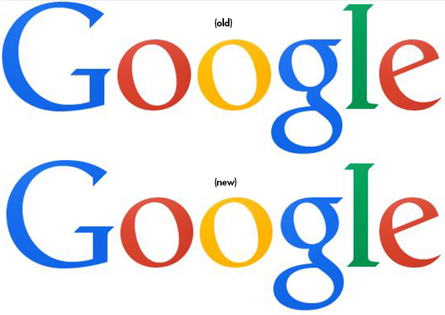
As some design aficionados have noticed, Google’s most recent logo has always looked just slightly off: The kerning — the spacing between the “o,” “g” and “l,” — was off. Barely, but enough to drive observant users crazy.
Redditor nal1200 noticed the change over the weekend and posted photos on Reddit, mentioning that the kerning issue “must have driven some design employee crazy.” The fix? Move the “g” one pixel to the right and the “l” one pixel down and to the right.
A Google spokesperson told Gizmodo it’s “great to see people notice and appreciate even single-pixel changes — we tweaked the logo a little while ago to make sure it looks its sharpest regardless of your screen resolution.”
Contact Stephanie Grimes at sgrimes@reviewjournal.com. Find her on Twitter: @stephgrimes


