
Displaying art depends on frame of reference


The importance of artwork and how it’s displayed has remained with me since childhood when I first took a picture of a pretty young woman set in a pastoral scene from a magazine, placed it in a wood frame ( purchased at the 5-and-10-cent store) and hung it on the wall.
I’ve learned through experience that framing and matting art is an acquired skill that takes some knowledge; and, as a professional designer, I usually turn to specialists for my framing needs and recommend that my clients do the same. Otherwise, it’s easy to wind up spending countless hours trying to choose frame colors and styles.
Still, there are some guidelines that can be followed that may help instill confidence in those of you who want to try it on your own and save some money in the process.
To begin with, the art you acquire is entirely up to you — it’s extremely personal. Never feel that you have to choose such-and-such a look; it’s not true. If the artwork speaks to you in some way, then by all means go with it.
Next, you may want to choose a mat to enhance your picture. Adding a mat or not also is a personal choice. The best way to decide is to simply try it. But, be aware that a mat will cause an additional expense. Still, it can often be extremely complementary to your art and is always worth some consideration as it also helps ensure that the picture is well-supported and protected from bending and creasing. Additionally, a mat creates a space between the artwork and the frame’s glass, which allows it to breathe, which is very important for original works of art.
There’s a simple rule for selecting a mat: Go with a lighter tone or neutral color. For example, you might choose a paler version of a color that’s in the artwork. If the mat color is too dark, then it might overshadow the image and make it appear lost. On the other hand, sometimes a black mat can be wonderful, especially when using a stainless steel frame. This usually works best when the picture is a photograph and mostly a black-and-white image.
Light tones will usually accent the art very well, and cream is always a safe bet. The mat should be chosen to match the colors in the picture and not the colors in the room in which it’s going to be displayed.
The standard width of a mat is usually 3 to 4 inches on the bottom and 3 three on the top and sides, but it may be narrower or wider depending on the size of the picture being framed. By the way, framers make the mat wider at the bottom to counteract an optical illusion that tends to make the top edge appear heavier.
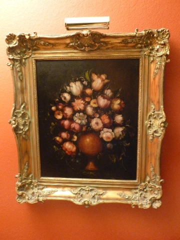
Now for the fun part — choosing the frame. The main question you need to ask yourself is whether the artwork is traditional or contemporary. Contemporary artwork will do well with black, brown, bronze and metal frames while traditional goes well with a champagne color, silver or gold ornate frame. As a designer, I often find gold a good choice when framing a still life done in oils, delicate watercolor landscapes or drawings of plants and flowers.
In any case, the frame should first and foremost enhance the picture aesthetically. Of course, where it will hang is important as well and ideally you want the frame to match the décor in your room. But, its first job is to make the picture look good. Never allow yourself to make more of the frame than the actual art. It’s important to remember that a great frame should support the artwork and never overpower it. Classic styles are the best way to go as they’ll work in any era and no matter what color your wall(s) might be.
Mixing it up is an interesting way to go, and is very much a trend today. You’ll see traditional rooms with modern frames and contemporary spaces with traditional frames. Again, the important thing is to focus on the artwork itself.
The size of the art also must be considered regardless of the style you decide to go with. It’s never a good idea to choose a large frame for a very small print. Frames are meant to complement the artwork in a subtle way, which means simply that it’s best when the frame is understated and not overwhelming. For example, you should use frames that are 2½ to 3½ inches wide for artwork that is 22-by-28 inches or larger.
Thinner frames, one-half inch to 1¾ inches are great for art that are 18-by-18 inches and smaller. They can be used on large artwork but seldom work as well.
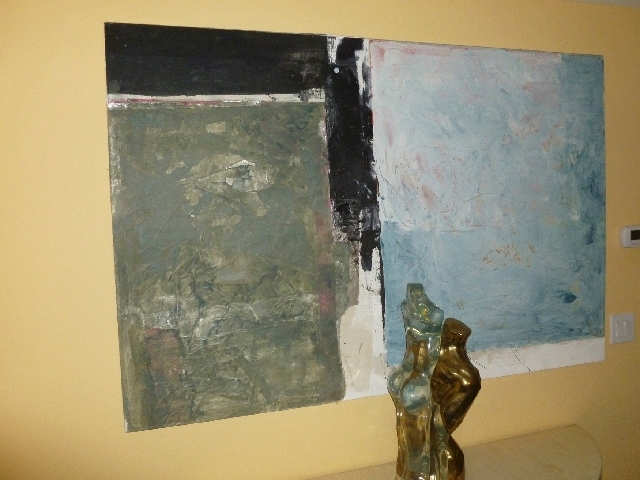
My advice is to either go big on large art or minimize the frame all together and choose a flush-mounted frame or a stretched canvas finish. I’ve found that abstracts are better shown unframed so that the colors and shapes are allowed to flow into the room and become a part of it. This works best if the art is painted on a very large canvas and can make a bold statement in the room.
Finally, the shape of your frame will depend on the artwork itself. A frame that slopes inward will work great for landscapes as it will enhance the perspective. And where perspective isn’t an issue, such as a still life, go with a frame that slopes away from the art. Contemporary art does best in frames that are flat and level with the picture and box frames are best for showing off very small art, which helps to set it back from the viewer.
There’s simply no hard and fast rules when it comes to framing pictures. Start with what you like and then give some thought to applying the aforementioned guidelines to help you make the best choices. And finally, for heaven’s sake, remember that most artwork has been designed to be viewed at eye level, not a bird’s-eye view.
Stephen Leon is a licensed interior designer and president of Soleil Design; he has been designing and manufacturing custom furniture and cabinetry for more than 25 years. He is president-elect of the Central California/Nevada Chapter of the American Society of Interior Designers and is a certified professional in green residential design. Questions can be sent to soleildesign@cox.net.


