
Red, white and blue in design bring out certain emotions


“Color speaks all languages.” — Joseph Addison (1672-1719), English dramatist, The Spectator (1711)
Color is essential in my life and I know it is to most of us. I’m not sure how that penchant developed but most people will admit to and take pleasure in their color favorites. So, today I want to address three colors we all deal with — red, white and blue. I know we’ve talked about these before, but guess what? The three have changed.
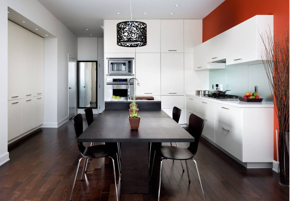
Red used to be a favorite of mine. It has a certain vibrancy and a “look at me” characteristic. Red accent walls used to be a decorating staple for a lot of designers, and I have had them done in many homes of friends and clients.
Red does go beautifully with any design style and can wake up a room like nothing else. It’s a warm color and brings to mind all manner of emotions; it also symbolizes power, love, hate, anger or danger.
But I have to say, designers and folks in general are not as in love with red as they once were. It still has appeal but maybe not to the degree that it once did. You don’t have to have a red wall to celebrate any of those emotions — red fabrics and accessories are endless.
In China, red still denotes purity, joy, celebration, happiness and prosperity. And a lot of Asian brides wear red.
So let these qualities into your bedroom, or any room, for that matter. You won’t regret it. People are sometimes afraid of red, but if you give it a chance, I think you will agree that it still rocks. Like most everything else, you may want to exercise moderation.
White is a mixed bag for me. The purity of white and the clean aesthetic associated with it are two attractions. I sometimes see cold, blank, stark, empty traits, and these are the ones I have trouble with.
For instance, white walls do have their place, possibly in an art gallery. And a lot of people wouldn’t dream of painting their walls anything but white; I believe there’s just a little fear of color there. A soft beige or cream color works just as well as a neutral and, quite frankly in my opinion, most colors in upholstery or case goods look much richer against a little bit of color than they do against a white wall.
White bed linen, bath towels and upholstery are great uses of the color white, but they need another color palette to make them look their best. And I do like white upholstery and have had a white sofa in my home for about 20 years. I don’t understand that totally either.
However, totally white rooms — walls and furniture — are popular today. Sometimes we see these in rooms that will display art, or the folks just like the no-color look.
And I am so anti-white walls that I remember when I moved into my house, it had just been painted by the previous owners — white. I literally couldn’t move in before I had it painted — not white.
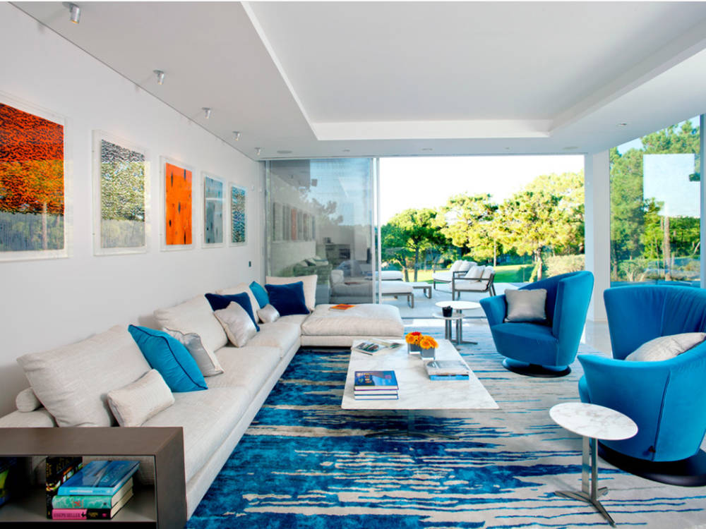
Blue used to be one of the most difficult colors for me. It’s a hard color to relate to other colors; it can be cold, and it diminishes your appetite.
Oh well, a little blue here and there is OK, but something as all-consuming as blue carpet is a definite no-no in my world. One of my year-end design tips that I publish every year is “never buy blue carpet.”
One of my friends told me some time ago that she wishes I had written those tips before she bought the blue carpet. It’s just a hard color to match and accessorize.
Having said that, blue and white patterns are so very popular now. You will almost always see blue furnishings, window treatments and accessories in beach residences. Fabrics, wallpaper, accessories, china, linens — just pick up any design magazine and pages are filled with blue and white.
But if you are considering a major purchase such as carpet please think it through. You may find that its appeal doesn’t last. If you look through furniture and carpet stores you will see that manufacturers agree, but you will see some. No question.
And having said all that about blue, I have to say — for some reason — I have become more attached to it and am even considering reupholstering a large piece of furniture in a bright blue. And I have this thing for blue print area rugs. Go figure.
Color is an amazing thing: It can affect your mood, your spirit and general well-being. Many emotions have long been associated with the three that we featured today: white as a sheet; feeling blue; red-faced. There are a million of those cliches, and if you translate those emotions into design I think you will see how it relates to your personal space.
Color, of course, is also very personal. If you like white walls and blue carpet, and fear red, by all means go with your heart. You are the artist and creator of your space. Just remember, loving a color and living with a color are two different things.
Carolyn Muse Grant is a founder and past president of the Architectural and Decorative Arts Society, as well as an interior design consultant and stylist specializing in home staging. She can be reached at creativemuse@cox.net.


