
Versatile Honeysuckle adds warmth, sense of excitement


Not everything is black and white -- especially when it comes to fashion, whether it's for your wardrobe or home décor. And this year, things are particularly rosy.
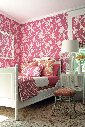
Honeysuckle, a warm shade of pink, was recently named the color of the year by Pantone, the global authority on color and provider of professional color standards for the design industries.
"When we make a choice in color, a lot of thought goes into why we choose what we choose," said Leatrice Eiseman, executive director of the Pantone Color Institute and author of a blog about color. "It's not arbitrary that we make a hot color and that's the end of story."
According to Eiseman, Honeysuckle was selected as the color of the year to help alleviate the general malaise caused by the state of the economy and world around us.
"We wanted something uplifting that gets your adrenaline pumping. All the things you can say about red, you also can say about this pink. It has all the energy and dynamism of the mother color but it's more complex than the mother color. We've taken red, a primary color, and added some fun to it."
The name of the color also evokes other emotions, including taste and smell.
Before being named the color of the year, Honeysuckle was just starting to appear in fashions and designs from Europe.
"What happens in fashion ultimately spills over into every other area," Eiseman said.
She said awareness of pink and the pink family has taken on a new quality beyond the pastel pink associated with baby girls, Barbie dolls and breast cancer.
"Men are more open to a hot shade of pink in their ties, shirts and sportswear, as well as sports equipment -- especially younger guys who will buy a piece of equipment, such as a snowboard, with hot pink on it."
"When I heard Honeysuckle was the color of year, I wasn't that excited. I thought 'Pink again.' We had seen pink not that long ago. However there's a lot to this color," said Carey Vizzi Jacobs, an interior designer with Carey Lind Designs of Hunt Valley, Md., and wallpaper designer for York. "It's not just pink, it's a great pink because it's extremely versatile."
Vizzi Jacobs said the color has become mainstream and is being used in a greater variety of applications.
"I can't think of a pink combination that doesn't work. Pink and red. Pink and navy. Pink and turquoise. It's a great complement to any interior," she said. "But you don't have to dump pink everywhere."
The warm shade of pink pairs easily with navy and orange, she added.
Pantone suggests adding a lively flair to interior spaces with Honeysuckle patterned pillows, bedspreads, small appliances and tabletop accessories, or painting a wall for a dynamic burst of energy in the family room, kitchen or hallway. Other ways to incorporate the color include place mats, table linens, colored glassware and candles. It's also a good color to cover up shabby kitchen cabinets or for knobs and drawer pulls.
"The easiest ways to bring color into your home is definitely with accessories, pillows and seasonal items," said Vizzi Jacobs. "But for me, what I personally enjoy doing is wallpaper. I like that feeling of color hugging you and putting its arms out on the walls, surrounding you and giving you that nice warm hug.
"Honeysuckle is really warm. It makes you happy. I'm not sure how you can say pink and not be happy," she said. "It's a happy color and who doesn't want to be happy these days?"
The emotional response to pink is a natural reaction to the role color plays in our lives.
"Color suggests a mood and helps you express your feelings, even though it may not be overtly obvious," Eiseman said. "Color can affect us emotionally, and when decorating our homes, it's a great way to express ourselves."
"I believe it affects your mood, and think we all, or most of us, want our homes to reflect a bit of our personality, be our oasis and something to be proud of. Color is an extension of our personalities," agreed Vizzi Jacobs.
For more information about the color of the year or color in general, visit Eiseman's blog at www.eisemancolor
blog.com.


