
LETTER: Henderson unilaterally makes logo change
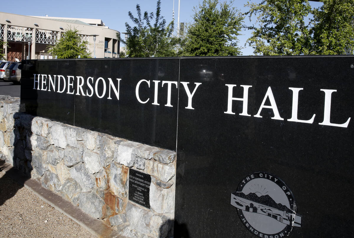


I read in the Sunday Review-Journal about Henderson’s plan to scrap their present city logo for a “new” one (“Henderson unveils minimalist logo”). Without consulting us residents about the change, or getting our input, a few city employees decided to thrust their idea down the residents’ throats. The designers thought the current logo looked like a “hamburger.”
So what did they do? They designed a giant “H” with a yellow half-circle surrounding it.
To me, the new logo looks like a design on a Hilton Hotel limousine. Or it could stand for Hamburger, Hollywood, Hyundai, ad infinitum. To make matters worse, the city now has to use taxpayer money to promote this atrocity, such as imprinting it on myriad city properties, documents, letterheads, uniforms, vehicles, etc.
I suggest city officials ask residents what they want, and if residents do want to change the logo, let them submit drawings, with the best one winning. In other words, let Henderson residents — whose money will be supporting this new logo — be part of the project.


