Local artists cheer — and boo — UNLV’s redesigned Rebels mascot
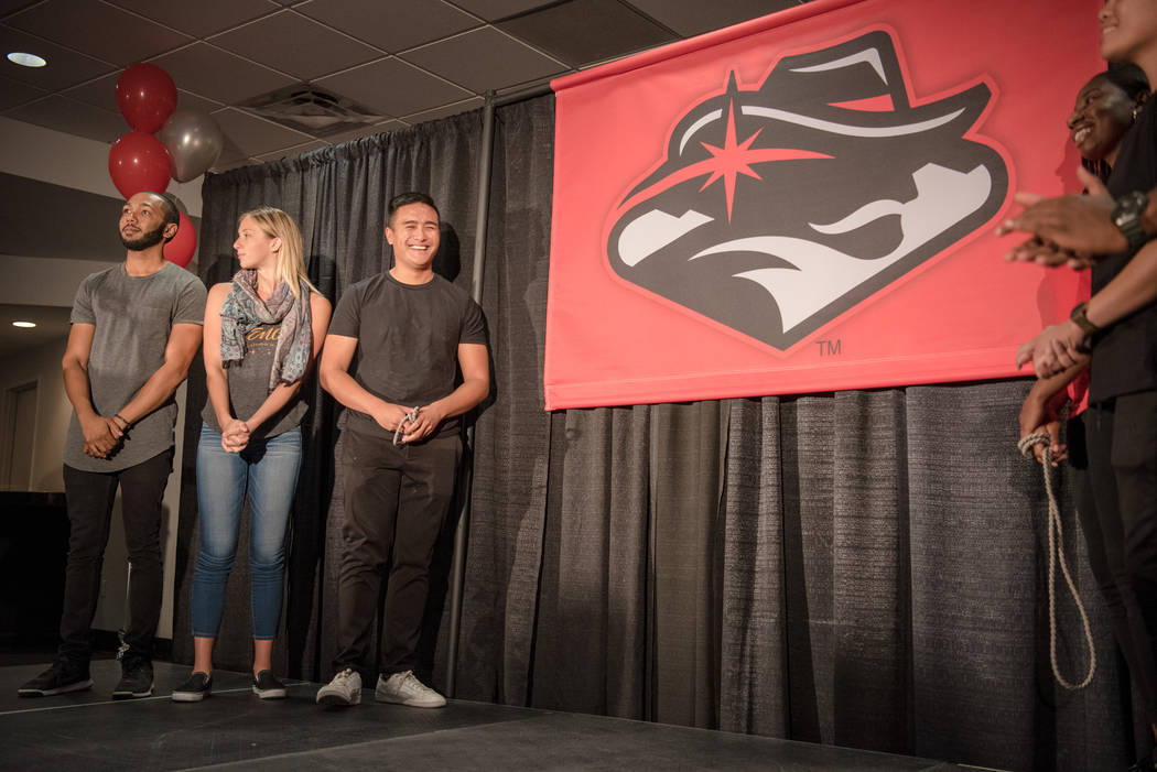
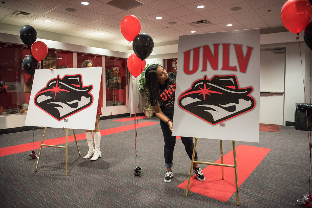


There’s been plenty of rebellious reaction since UNLV introduced its new-look Rebels logo on Wednesday.
But not everyone thinks the stylized team symbol is a loser.
True, many local artists contacted by the Review-Journal — in an utterly unscientific survey — shared the general disdain for the redesign.
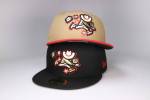
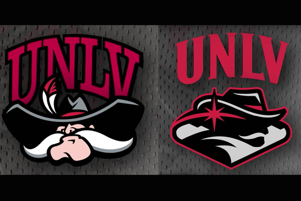
But a few responded positively to the replacement for the Hey Reb! mountain man logo, which was retired after an 11-year run.
The new logo incorporates such familiar local features as the iconic “Welcome to Fabulous Las Vegas” sign’s outline and twinkling star, along with a sleeker, streamlined image of UNLV’s cowboy-hatted, mustachioed resident Rebel.
To local artist Gig Depio, the new logo has “definitely got some artistic (although cryptic) quality to it,” he says. “As an artist, I like visually challenging art that doesn’t give itself away so easily.”
Another fan is Michele C. Quinn of MCQ Fine Art Advisory, who co-curated the recent “Tilting the Basin” exhibit showcasing Nevada artists at Reno’s Nevada Museum of Art and downtown Las Vegas pop-up gallery.
“It’s clean and modern,” Quinn says of the new logo. “I think it brings a fresh look to UNLV. It was time for an updated look.”
It may have been time for an updated look, but not this one, several other artists contend.
“It might as well be UNLV with a Superman logo,” comments Ruzo Logic, whose District Artz nonprofit organizes mural and Guerrilla Kages painting sessions around town.
Another artist (who asked not to be identified because “I know other artists work with everything they’ve got — sometimes it works, sometimes not”) maintains that “the logo just doesn’t work. The minute you have to explain how clever your logo is, it’s not a good sign.”
Artist Sush Machida admits, “I just don’t get the logo. Is it a Rebel guy in a cowboy hat? Is it a star in his eye? I just can’t tell what it is. I liked the old one — it was classic and lovable. This one, not.”
Other criticisms range from the “cliche” of the Welcome to Fabulous Las Vegas sign outline to the difficulty of recognizing different shapes featured in the new design.
“Even after I learned what they were intended to be,” one artist notes, “I still couldn’t visually understand the bandanna and the mustache-to-mountains shapes.”
For artist Alexander P. Huerta, the logo’s biggest problem is that “it’s dull,” he says. “It has no Las Vegas pizzazz.” In addition, “it has too much of a manufactured look.”
Although Depio likes the logo, “the question still remains, does it do its job as a logo?” and “will the majority of the community culturally identify with this symbol?”
Only time will tell, but to artist and cultural blogger Ed Fuentes — a former graphic designer for whom logo design was “my favorite thing to do” — the heated reaction means “the logo works, because everybody’s rebelling against it.”
But seriously, folks, “there are only so many things you can do” with any logo, Fuentes adds, because “mascots tend to be repetitive.”
As he explains, “a good logo is like a good headline,” connecting “your right brain and your left brain.” But, “as a marketing tool … you can’t stray too far.”
At first glance, according to artist (and College of Southern Nevada instructor) Wayne Littlejohn, “the image is somewhat abstract and a bit confusing.” Then again, “even the Golden Knights logo took a little warming up to,” he says of Las Vegas’ new hockey team, adding “I have a (Golden Knights) hat now.”
“Some of the best images take time to reveal their merits,” Littlejohn comments.
Besides, “it’s a sports logo,” Fuentes reasons. “It doesn’t have to be a tattoo.”
Contact Carol Cling at ccling@reviewjournal.com or 702-383-0272. Follow @CarolSCling on Twitter.