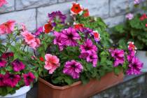
A rainbow of options


Color is all around us. It influences our moods and helps us express our personalities. Certain colors mark changes in season or bring holidays to mind.
In the world of home decorating, color is a design element as important as selecting the perfect sofa or accessory.
“Color can enhance a space like no other design element,” said Sharon Grech, a color expert with Benjamin Moore paints.
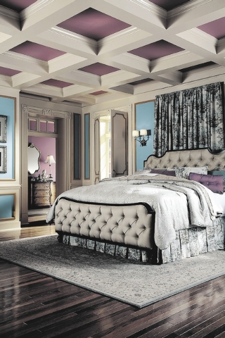
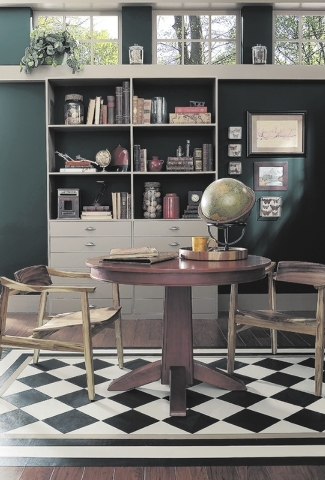
“Color creates mood in the home, and therefore enhances the function of the spaces where we live, play and work. Every color has an emotional attribute associated with it. Purples, greens and blues are cool and tranquil, perfect for rooms where relaxation or concentration is the goal. Yellows, reds and oranges are warm and energizing, great for rooms where activities will be taking place,” said Erika Woelfel, director of color marketing for Behr Paints.
Catie Parrish, chief homemaker of wayfair.com, said color is an important factor in decorating a home.
“It can be a reflection of yourself in your home, set a mood and reinforce your style. Even black and white, which many consider to be a lack of color (or at least the most basic hues) makes a statement,” she said.
Parrish said color can be used on walls, furnishings, case goods and accessories. “There’s no wrong place for color. A basic formula for a harmonious color palette is 60 percent your dominant color, 30 percent your secondary color and 10 percent your accent color.”
“We see color used everywhere. Of course, there should be a relief because saturation can be uncomfortable for many people,” said Beth Pope principal of ESP Designs, an interior design and consulting firm in Las Vegas, and president of the Architectural and Decorative Arts Society. “As a former specialty painter, I used color in all intensities on walls, furniture and anything else that I felt could or should be altered to make the environment more inviting. At the same time I do love beautiful wood and its organic back-to-nature feel. In my own home I have lots of color, but I stay a little more mainstream when it comes to painting walls and choosing floor covering.”
“Where you choose to add color, whether it’s on the walls or among home furnishings and accessories, is entirely up to you,” said Aimee Beatty, in-house stylist for Pier 1 Imports. “This is the opportunity to decide what is livable and tasteful according to your own standards.”
Still, she cautions that using color does draw attention to the item or space.
“Remember — what tends to have bright or bold colors will become a focal point in the room. Add color to places where you want to draw attention — a collection of vibrant bird plates hung on the kitchen wall, a fun mix of pillows on the sofa or perhaps a bold rug in the dining room.”
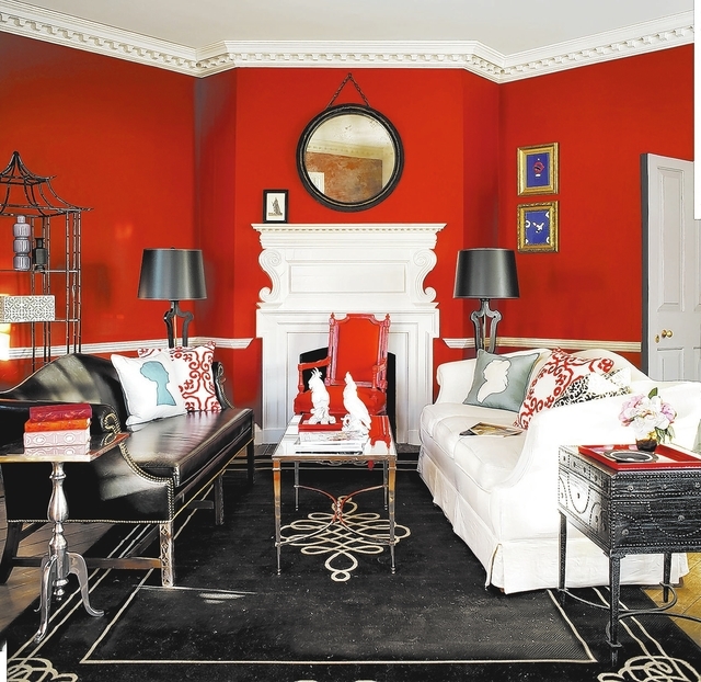
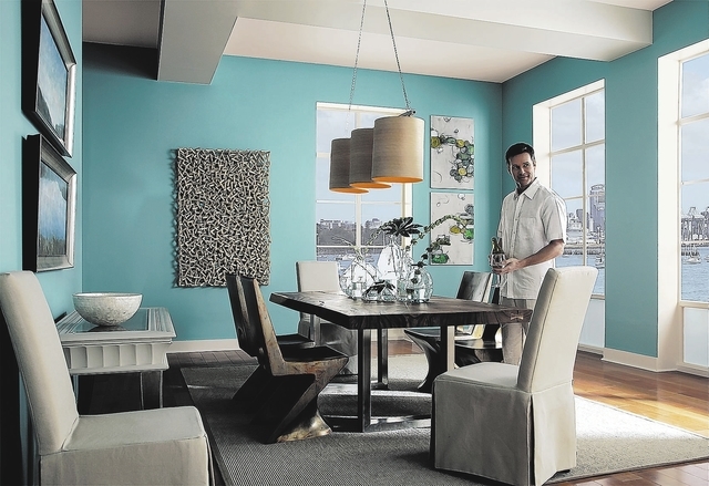
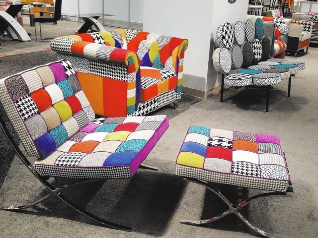
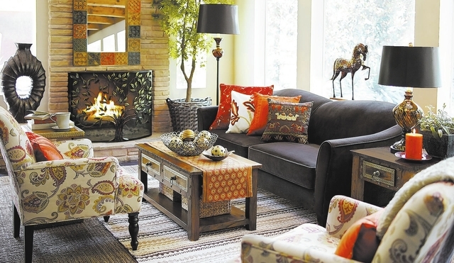
At the recent home furnishings show at World Market Center Las Vegas, color, especially bright, bold shades, were evident everywhere. From upholstery to accessories, showrooms were filled with products in varying shades of red, blue, green, yellow and orange.
“We look to furniture markets to capture upcoming trends, and bright pops of color have definitely been on the rise,” Grech said.
“I think that the midcentury revisit has spurred on the orange, lime green and turquoise phase we are experiencing. I like it better now than I did in the ’50s,” Pope said. “I grew up in Michigan and I have never felt that those colors worked as well there as they do in the Southwest and Southern states because the sunlight is so different. I have learned to appreciate that look since living here.”
She said those colors also are “happy colors” and manufacturers said they reflect the optimism seen in the industry and nation for a better economy.
Despite this, Pope said she believes it is best to use these “fad” colors in accessories, which can be easily changed and cost less.
Woelfel agreed. She said bright pops of color are fun, but are best for an accent wall and in small doses.
“When choosing accents, remember a little goes a long way. Use only one color as an accent.”
Grech said one way to bring in an element of color is to “upcycle” used furniture with paint.
“Brighter colors are popular today for upholstered goods as well as cabinets and tiles. These generally smaller items instantly become statement pieces in a bold color as does a brightly painted accent color for a wall.”
Added Parrish, “Bright colors are also a fun way to differentiate your décor from everyone else’s. If it’s a color you find in your wardrobe often, try it on your walls. You already know you look good in it.”
Despite their popularity, Grech said those decorating their homes should not select trend colors just because they are trendy.
“Although I feel that there is a home for every color … it’s all about context. Choosing colors that complement your adjacent furnishings is critical to creating a harmonious scheme. Avoid colors that are jarring in the context of your space and you will be safe.”
“Intense brights or strong deep colors can be hard to live with for long periods of time,” Woelfel said. “Colors like these are best used in rooms where you will not spend a great deal of time. Dark burgundy walls may glow in the lamplight during the evening, but think about being surrounded by this color all day long.”
Instead of following trends for the main color in your room, Pope said you should use your “go-to-colors that we know we can live with comfortably. The trick is learning what your boundaries are.”
She said she has always “loved to use warm beiges, rich yellows and mellow whites because I like a warm palate, but what I would have chosen 10 years ago is not necessarily what is offered today. Others may prefer a gray base to their whites with soft taupes and a cool palate.”
She likes to use red in a dining room because of its energy.
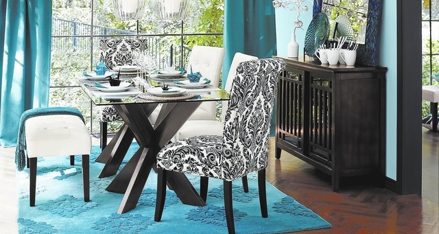
Parrish said blues also are a safe bet.
“From navy to cerulean, there’s a shade for everyone, and it appeals to both men and women.”
“Choosing colors for the home is going to be different for everyone,” Beatty said. “To make things easy, darker tones like reds, blues and browns can be great for a masculine look. A blend of different blues is great for creating a calming and pleasant atmosphere, while brighter yellows, greens and oranges are great for an upbeat look.”
So, are there any colors that should be avoided?
“No,” said Parrish. “There’s no such thing as a bad color … just some iffy combinations. When in doubt, balance warm and cool hues and lighten it up with neutrals.”
“If you start playing with colors and get overwhelmed by something not looking right, that usually means you have too many elements mixed together. Keep color combinations simple, as a means to get the look you ultimately are after — this is the fun part!” Beatty said.