Sherwin-Williams chooses Coral Reef for hue of 2015
According to the Chinese zodiac calendar, 2015 is the year of the sheep. Apparently, Jackie Jordan didn’t get the memo.
As director of color marketing for paint giant Sherwin-Williams, she was assigned to choose a hue from the company’s expansive product line to serve as its Color of the Year for 2015.
There is nothing sheepish about Coral Reef — the paint color Jordan selected earlier this year for the designation.
“It’s beautiful. It’s a vibrant color, it’s vivacious. It is optimistic,” Jordan said during a recent call from Sherwin-Williams’ offices in Dallas.
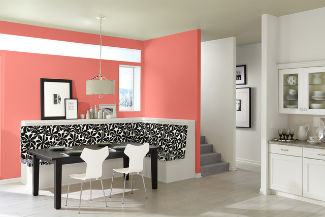
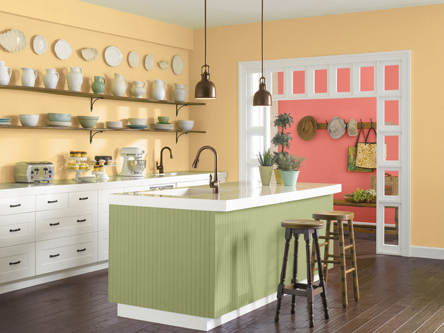
Above all, it is bright: Coral Reef is described in company literature as “the perfect mélange of pink, orange and red that can be used to liven up any space.”
The color red, Jordan explained, often “can have maybe too much bravado, and orange can sometimes be a little bit too youthful, so I felt this was a nice balance between those two colors. It had the energy of both.”
It is one of 40 colors grouped into a quartet of “palettes” that comprise Sherwin-Williams’ “Color Forecast” for 2015. The paints are available for purchase at the company’s stores nationwide.
Benjie Swenson is a big fan of Coral Reef. The interior designer owns Merge, a firm she founded in 2008 in Las Vegas before moving to Southern California.
Swenson is also a member of the International Association of Color Consultants/Designers — North America, a professional organization that trains and accredits it members as color consultants and designers.
“I love it,” Swenson said of Coral Reef. “It’s very vibrant, and it’s got a hint of femininity, but it’s not over-the-top girly.”
She is using coral as an accent color at the Camden Vintage apartment community, at 6500 Vegas Drive, where her company is designing residential-amenity areas, including the clubhouse and fitness center.
Swenson also intends to incorporate the color at another local apartment community on which she’ll begin work in January.
“We’re playing it up in soft accessories,” such as pillows, and with decorative items like vases, she said.
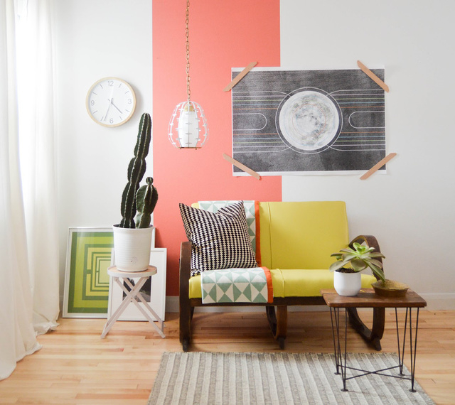
Coral Reef, she said, “references old-time glamour as well as a fresh, modern take” on design. “You can mute the pink in it with some grays and creams so it doesn’t read so … feminine, or you can play up that color. I feel like it can go a lot of different directions.”
Jordan agrees with Swenson.
“It can take on different personalities,” Jordan says. “You can pair it with a very calm, soothing color, and you can pair it with other vibrant colors to make it even more vivacious than it already is.”
Coral Reef is part of Sherwin-Williams’ Buoyant palette, which Jordan said “reflects our enthusiasm with colors that evoke big, bright florals in fashion and interiors.”
The company’s other palettes are Unrestrained, featuring contemporary colors that were “very much born out of the arts’ scene,” Jordan said; Chrysalis, a landscape-inspired collection that boasts an “ethereal feel”; and Voyage, with futuristic colors that reflect both space travel and underwater exploration.
“(Coral Reef) has this Hawaiian spirit, if you will, so it really was about this kind of tropical destination and bringing back some of those colors of the tropics,” she explained.
Color authority Pantone predicts floral prints’ growing popularity will similarly thrust its pick for Color of the Year for 2015 — a wine-red hue called Marsala — into the spotlight.
In company literature, Pantone said to expect spins on Marsala to appear in men’s and women’s clothing, fashion accessories and jewelry in the coming year.
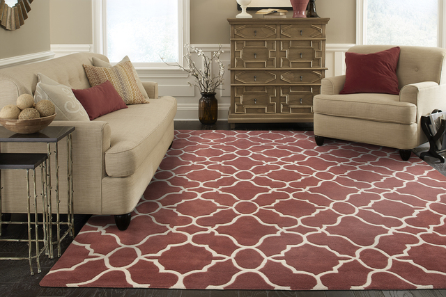
Leatrice Eiseman, executive director of the Pantone Color Institute, said Marsala’s “red-brown roots emanate a sophisticated, natural earthiness,” while its “hearty-yet-stylish tone is universally appealing and easily translates to fashion, beauty, industrial design, home furnishings and interiors.”
One element that Marsala may lack, however, is a sort of “optimism” that Jordan contended Coral Reef exudes, which she said will help propel the United States forward next year.
With the nation’s financial recession mostly past, markets and moods are improving, she said.
“We’re finally seeing signs of growth and expansion,” she said. “We finally are having this kind of better mood and better spirit, and we’re feeling better about things, so that was one of the drivers (behind color selections for the Buoyant palette).”
Although coral hues were also white-hot during the 1980s, Jordan said they “probably took on more of a peachier tone” than today’s more modern incarnation, which pairs well with big interior-design trends including industrial-looking metal, wood and mirrored finishes, as well as gray, linen and off-white colors.
Ken Wolfson, owner of Las Vegas-based Ken Wolfson Interior Design, called Coral Reef “a breath of fresh air” reminiscent of 1920s art-deco designs.
Wolfson designed and developed The Avenue, a residential loft and office building at 621 S. Tonopah Drive. His firm recently completed work on the newly opened Farmers Market Hawaii retail store, at 8174 Las Vegas Blvd. South.
Although he hasn’t yet received requests from clients to slap Coral Reef on their walls (“I think it is a little ahead of its time”), he said he looks forward to using it on upcoming projects, possibly as an accent wall behind a bed adorned with linen- or taupe-colored bedding.
As a result of recent design trends, “We’re all getting saturated with drab colors and … that distressed wood-kind of thing,” he said. “It’s really starting to grow a little old, so it doesn’t surprise me that … going in a more cheerful, bright direction is what’s happening. It makes a lot of sense.”
“When you walk into a room that’s too tone-on-tone or too gray or too beige, it really kind of falls flat,” Wolfson said. “I think that’s why you’re seeing some of these brighter colors, especially Coral Reef, come around — to give that contrast and bring some life to a room.”


