UNLV should admit mistake, start over with new logo


“We cannot solve our problems with the same thinking we used when we created them.”
— Albert Einstein
When it comes to UNLV’s new spirit logo, Mr. Physics would offer this advice to those responsible: Take a mulligan, and do a better job next time of involving your chief audience.
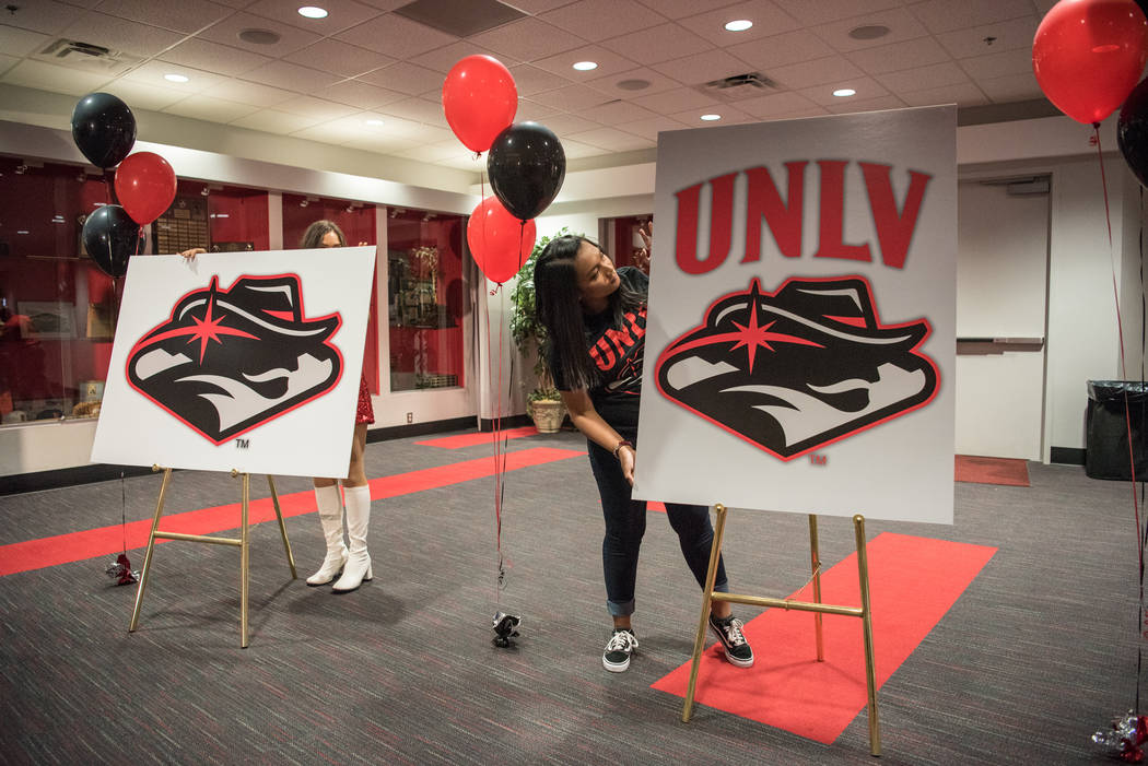
The most difficult step for a university is admitting it fumbled such an important decision like a running back might a football, and yet for as much as social media unmercifully ripped the confusing Hey Reb! mark unveiled in June, it appears those in charge are standing behind it.
Which doesn’t mean they’re promoting it like crazy.
Football meetings for the Mountain West — one of the league’s biggest and most attended media gatherings each year — were held last month and there wasn’t a sign or sniff of the new logo.
T-shirts with it have been spotted at the school’s book store, but I’m guessing they’re not back-logged on orders.
There is a reason athletic department employees have been told in meetings that until otherwise informed, teams will be recognized by the more traditional UNLV letters in arched form.
It’s true rolling out a new spirit logo can be a long and expensive process — you can’t change every jersey and helmet and car decal and piece of merchandise over night — but what could take years to complete such a transition would be better served by UNLV returning to its base with this message: Yeah, we messed up, so now we want you to help fix it.
Get fans involved. Make them feel part of the solution. Turn what has obviously been a more negative reaction into a positive one by allowing those who support your teams most a louder voice.
You will never appease everyone when it comes to a spirit logo, but what about, well, closer to half?
“You know, we appreciate the passion of our fans, which is one of the things that I believe makes us a great university,” UNLV president Len Jessup said. “I appreciated everything I saw and heard on social media about (the logo) — both positive and negative. We’re willing to listen to feedback any time. We’re always open to that. It’s art. There are going to be varied opinions, and I think each one is valid.”
Here’s the thing: You should never look at a spirit logo and have to think.
Not, like, ever.
Not, like, for a second.
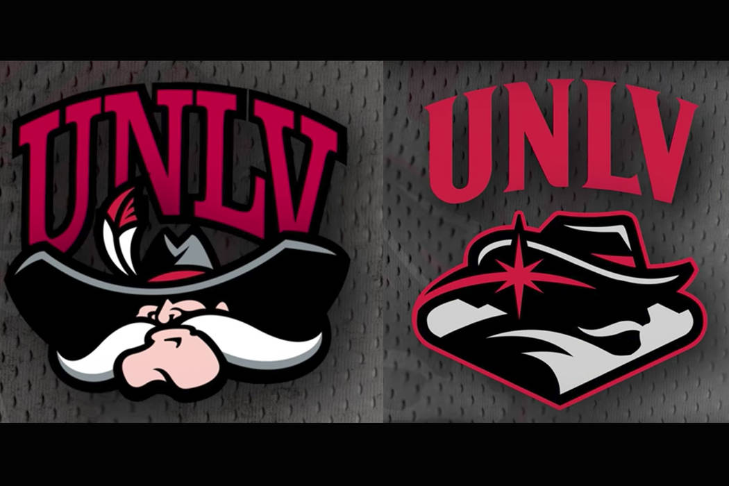
The fighting leprechaun. The longhorn silhouette. The tiger paw. The Spartan helmet. The schools are immediately distinguishable.
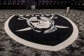
UNLV teamed with a Denver-based design firm (huh?) to produce something more confusing than the map Nicolas Cage used to find that treasure hidden by freemasons. We ran a picture of the logo on the front of the R-J and I’m still figuring out whether or not I should apply heat to it in hopes some ferrous sulfate ink becomes visible and I can decode the Silence Dogood letters.
Is that a mustache or Meerschaum pipe?
Zach Morris is 26 and attends the Boyd School of Law at UNLV, a lifetime Rebels fan who was so put off by the new spirit logo, began a petition entitled, #NotMyReb and #MakeRebGreatAgain.
He thought it might generate a few hundred signatures.
It’s at 6,100 and counting, far more folks than attended most home basketball games last season.
“Mostly, I would say the logo is confusing,” said Morris, who met with top university officials on the matter. “There’s a lot going on in that logo. I’m not a confrontational person. I like to look at things pragmatically and neutrally. I didn’t meet with them to harass anyone, but to simply present a Power Point on my arguments against it and common feedback we’ve had through the petition. It’s OK to disagree and not be disagreeable.
“There have been other examples of schools that also made bad decisions when it comes to this kind of thing. Some listened to the people and made changes and it was a very positive outcome for everyone. Others did nothing and hoped time would ease the pain. I believe they should have used the community more from the beginning. Use their own art school. It would have cost less and produced a much better outcome.”
Translation: UNLV over-thought the room, and paid in the neighborhood of $50,000 while doing so.
Spirit logos are often secondary marks as a way to identify teams, and the arched UNLV is a symbol recognized globally. People everywhere know what it means, much like a scripted UCLA or a blocked M for Michigan.
So while the primary manner in which UNLV teams are recognized remains consistent, the new spirit logo isn’t getting any better — or more transparent — as it slowly arrives into public view.
UNLV should admit it goofed, open its arms to starting completely over and intimately involve its base this time when crafting a new design.
This could all work out with a much better logo (it can’t get any worse) and happier fans.
For this, I won’t hold my breath, because I’m not yet prepared to turn blue and die.
Contact columnist Ed Graney at egraney@reviewjournal.com or 702-383-4618. He can be heard on “The Press Box,” ESPN Radio 100.9 FM and 1100 AM from 11 a.m. to 2 p.m. Monday through Friday. Follow @edgraney on Twitter.