Color trends for the new year
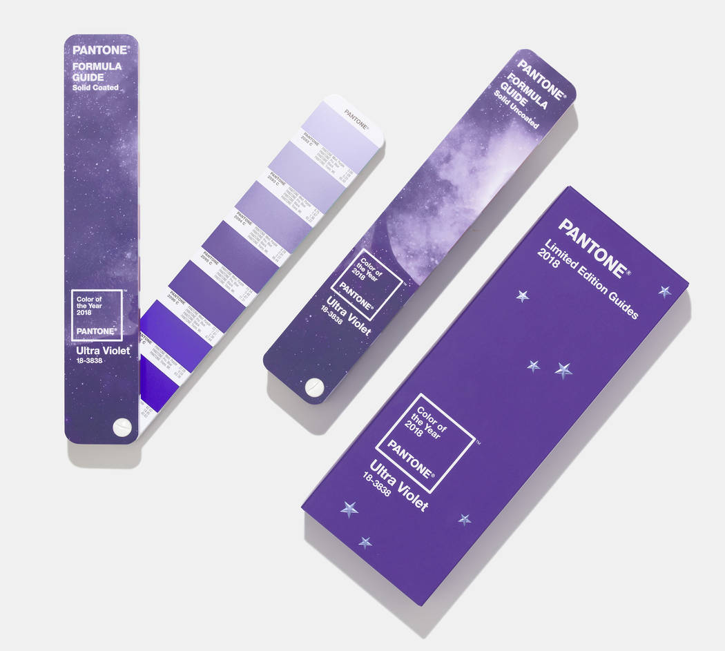


Purple will reign in 2018.
So predict the experts at Pantone, the New Jersey-based company that is considered the international authority on color trends. In December, it named a “dramatically provocative and thoughtful” purple hue called Ultra Violet its choice for color of the year.
In a statement, Leatrice Eiseman, executive director of the Pantone Color Institute, said, “From exploring new technologies and the greater galaxy, to artistic expression and spiritual reflection, intuitive Ultra Violet lights the way to what is yet to come.”
Consumers should look for purple to surface this year on all types of packaging and in graphic designs, as well as home decor, cosmetics and on fashion runways. Also in the colorful mix: cruciferous vegetables like purple cauliflower and purple cabbage, which the company calls the new “it” foods for their ability to bring “vibrancy and sophistication to the table.”
Unfortunately, Jill Abelman is not a fan.
The CEO and principal designer of Inside Style, a luxury interior design firm in Las Vegas, said the particular shade picked by Pantone is among her least favorites, although she does “enjoy seeing a deeper tone of purple in interiors on walls or in accessories and pillows.”
However, she did give a thumbs-up to some of the other hues that were designated 2018’s colors of the year by more than a half-dozen of the nation’s largest paint manufacturers.
In addition to purple, keep an eye out this year for various shades of green.
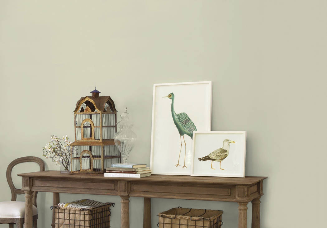
Kelly-Moore Paints’ Bahia Grass is a pale green that Mary Lawlor, the company’s color marketing manager, said was selected by crowdsourcing members of the American Society of Interior Designers, who voted for the winning color.
Lawlor calls it a “transitional” shade that will work well as interior design styles begin to shift away from the wildly popular gray hues that have dominated in recent years toward a forthcoming barrage of beige.
Bahia Grass is “delicate enough that it could be used pretty much anywhere in the home,” she said. “You can still keep that with your gray-overall theme that’s going on, but … in a kitchen with white cabinetry, it would be really stunning and warm.”
“That one is really soft, really versatile,” Abelman said, adding that she might consider painting it in a bedroom or home office. “It’s an all-around good green.”
In contrast, The Green Hour by Dunn-Edwards Paints is a more complex shade, according to Sara McLean, color expert and stylist for the Los Angeles-based manufacturer.
She researched global color trends for more than a year before selecting the color, which she said points to a return to a Gilded Age-type aesthetic, as well as maximalism and revival styles.
Despite its name, the hue can appear blue in certain lighting conditions, she said. “Green is essentially a neutral (color), and this is just amping up that aspect of it. … It really plays well with a variety of color matches from grays to oranges to reds and other shades of blues and greens, so it really creates a wealth of possibilities.”
Ken Wolfson, owner and principal designer at Las Vegas luxury firm Ken Wolfson Interior Design, said The Green Hour’s nod to art-deco design is interesting. “I think it’s a great color.”
On the other hand, he is not enamored with In The Moment by Behr Paint.
“That’s a tough color,” he said of the blue-green-gray hue. “The farmhouse-modern (design trend) has exploded, so this whole kind of antique 1920s (aesthetic) mixed with modern (styles) is a huge trend, and so I understand why they went that direction.”
Erica Woelfel, vice president of Behr’s color and creative services, called the shade “the perfect coalescence” of the aforementioned colors.
“We feel like it’s very approachable,” she said, especially when creating a spa-like bathroom and soothing bedroom space. “It’s just a really easy color to use.”
Abelman disagreed. “I don’t know if it ever won’t remind me of a hospital,” she said, or at least the drab scrubs traditionally worn by staffers. “I don’t think I would use it.”
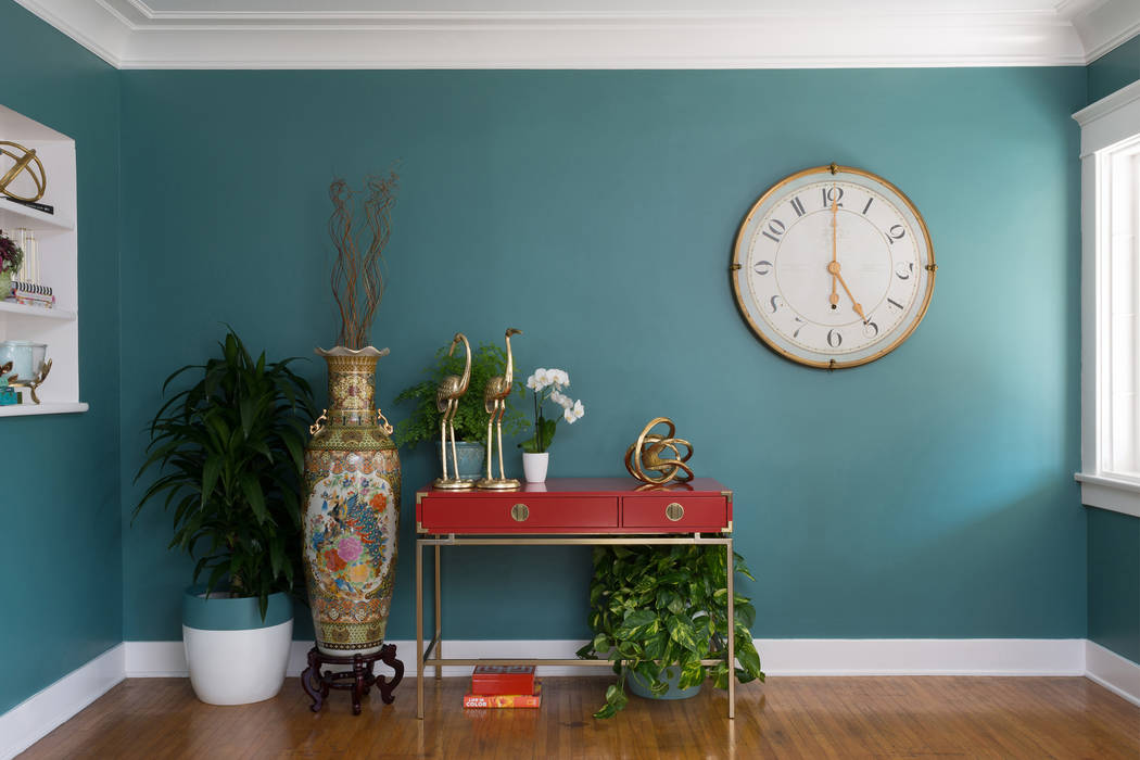
However, she does like Sherwin-Williams’ Oceanside, a vibrant teal blue that boasts a midcentury-modern vibe.
“I totally dig that color,” Abelman said. She would potentially use it in “a really fun (home) library or office. … I think it’s beautiful, but you’d need an adventurous spirit” to paint it on walls.
Sue Wadden, Sherwin-Williams’ director of color marketing, said online searches of 1950s- and ‘60s-era interior design trends often yield images featuring colors akin to Oceanside.
“It’s in dining rooms and living rooms, and it’s gorgeous. We spent so long with neutrals and lights. Now we’re kind of looking to color again, and it takes some getting used to,” she said.
Wolfson called the shade “fantastic” and envisions using it in uber-popular farmhouse-modern designs, as well as more modern settings.
“Bold color on the walls with the right furniture (in) the right context makes you feel good, and this color is a very good-feeling color,” he said. “It’s bold and luxurious.”
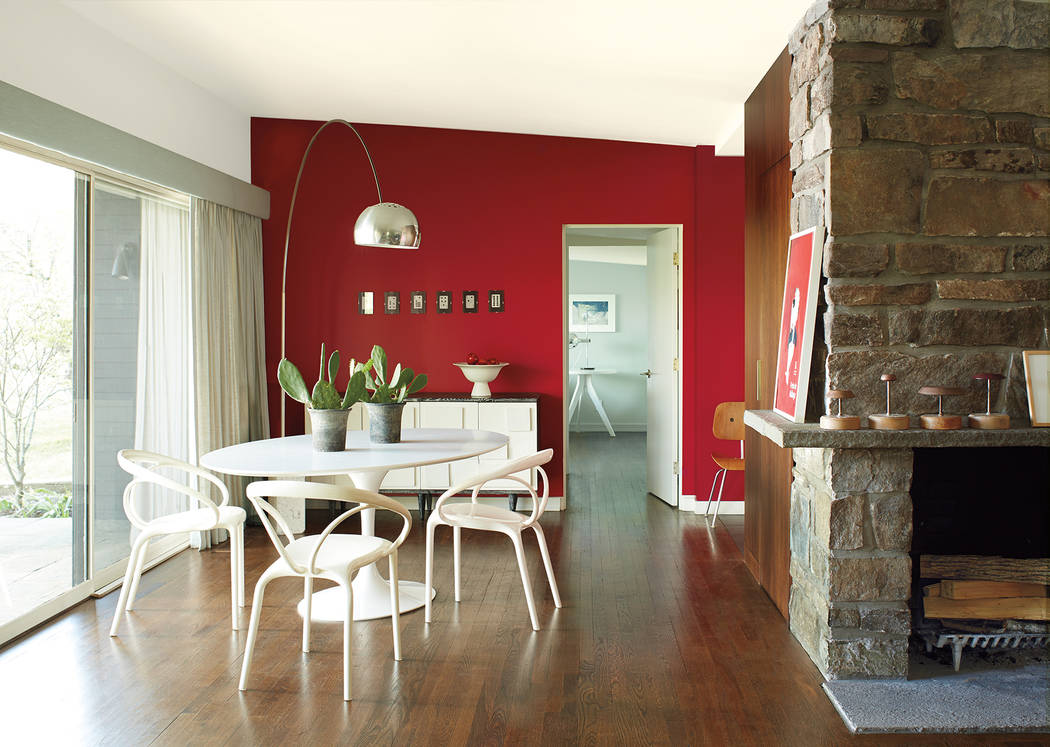
The latter is also how he described Caliente, a red hue by Benjamin Moore &Co. that Wolfson deemed his favorite of all the 2018 color of the year selections.
Following a year’s worth of research, Caliente was selected by a team of seven Benjamin Moore employees who traveled to 31 countries and snapped more than 42,000 photos to learn “what’s influential, how do people live with different colors … and really synthesize that into a color that is livable on our walls,” explained Hannah Yeo, the company’s color and design expert.
She called the shade “classic yet poppy,” with the ability to show “a little bit of character without overdoing it.”
“This particular red is really special because it’s got black (undertones in it),” Wolfson explained. “It’s not a fire-engine red or a stop-sign red. Because of the black and charcoal in it, that’s what makes it work.”
Abelman likened the color to a lipstick red. “That one is just a little too bright for most applications that I would be interested in,” she said. “I see it as more of an accent (color) in fabrics, pillows, draperies maybe — something where you’re making a little bit smaller of a statement. … It’s a little bit intense for every day, all day.”
At least it isn’t boring, which is how she described Dutch Boy Paints’ Sandstone Tint, a neutral “greige” (a blend of gray and beige).
“I don’t even know if you can call that a color. It’s just a background,” Abelman said. “That’s like the color of the year for homebuilders. .. That one says to me, ‘OK, we just moved in. We have no idea what to do with the walls, so we’re going to paint everything beige.’”
That is precisely the point, according to Rachel Skafidas, senior designer for Dutch Boy. “It’s a very simple and clean color,” she said, calling it a “breather color, one that makes you just stop and catch your breath.”
“In this chaotic world that we live in, people just want to feel safe in their homes. … This color works perfectly for that,” Skafidas said, and it won’t overshadow more dramatic furniture and accessories. “If you have a vibrant piece of artwork that you want to display or you’ve found that perfect royal-blue sofa, it’s going to look great with the wall color.”
Wolfson doesn’t need convincing. “It’s a super-great color,” he said of Sandstone Tint, and he recommends painting rooms from floor to ceiling with the shade. “Yes, this looks boring, but if you do the entire house … all the surfaces this color, it’s surprisingly exciting. It’s a very sophisticated color.”
If it’s sophistication that homeowners want, PPG Paints (which also owns the Glidden and Olympic paint brands) attempts to deliver it via a trio of black shades it chose as its colors of the year.
Dee Schlotter, PPG’s senior color marketing manager, said its 26-member global color team selected the “misunderstood neutral” because black best represents the current “collective, somber mood” that exists surrounding the global economy and international politics, among other issues.
“We looked at the rebelliousness in the world, the unsettled feeling, the need to express yourself no matter what side you’re on,” she said. There is also greater desire for privacy, which black traditionally provides. “It’s a serious color … and makes you feel a little more protected from the crazy, chaotic world around us.”
The navy-blue undertone that permeates PPG’s Black Flame underscores “that need for meditation and just silence,” Schlotter explained. It also provides a little twist on the “true black” that is Olympic’s Black Magic.
She called Glidden’s Deep Onyx a “no-fuss shade of black. … It’s just like that little black dress that you have in your closet that can work with anything.”
“All of these blacks are great,” Wolfson said. “What’s interesting about black is that it ends up being warmer and more comfortable and more peaceful than you would think.”
Deep Onyx is his favorite of the three colors. “It’s awesome. It just pops. It’s very exciting. It just adds a lot of style,” he said.
Although Wolfson called Black Flame “gorgeous,” he warned its blue tone could prove challenging when applied on the walls of a room with multiple exterior windows. “The blue sky can kind of play with that color, so it’s something you have to be careful with.”
Abelman said she appreciates Black Magic’s beauty.
“That one has a little bit more charcoal in it. … I think it is gorgeous as a backdrop for beautiful artwork and mirrors (with) creamy, lighter furnishings in front of it,” she said. “It definitely gives you the high drama, which I particularly love.”
No matter the color, however, she said color of the year selections rarely come into play when she designs spaces for her customers.
“It’s more about what the client wants and what works for them … and if (a color of the year) happens to creep in there, that’s great, but it’s not something I use as a guide in any way,” Abelman said. “I’d rather have my designs for clients be timeless.”