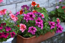
Rainbow of hues to choose


Are you sick and tired of social media? Overwhelmed by ever-changing technology? In need of nurturing?
The folks at Pantone thought that might be the case.
Earlier this month the New Jersey-based company, considered the international expert on color trends, designated a “life-affirming” orange hue dubbed Living Coral as the color of the year for 2019.
“Just as coral reefs are a source of sustenance and shelter to sea life, vibrant-yet-mellow … Living Coral embraces us with warmth and nourishment to provide comfort and buoyancy in our continually shifting environment,” the company said in a statement.
“In reaction to the onslaught of digital technology and social media increasingly embedding into daily life, we are seeking authentic and immersive experiences that enable connection and intimacy. Sociable and spirited, the engaging nature of … Living Coral welcomes and encourages lighthearted activity.”
Daniella Villamil is pleased with Pantone’s selection.
“This is a lively and cheery color that adds warmth and coziness to any room,” said the owner of Daniella Villamil Interiors in Las Vegas, who has designed residential and commercial spaces locally and in Miami and New York.
Meanwhile, more than a half-dozen major paint manufacturers also chose shades to market as their 2019 colors of the year.
Sara McLean, color expert and stylist for Dunn-Edwards, said she selected the company’s fire-brick red hue called Spice of Life because its earthy tone provides a “respite” from the chaos and technology that dominate the world.
Villamil thinks it is “an exotic and bold color … that will definitely make a statement in any room you put it in.”
Daniel Matus, principal designer, founder and CEO of Desired Space in Las Vegas, is also a Spice of Life fan. He describes it as “your grandmother’s more modern red.”
His company has designed luxury residences at Turnberry Towers and multifamily units for Zappos in downtown Las Vegas. It also created interiors and branding materials for the Hot N Juicy Crawfish restaurant chain’s outlets locally and around the country.
Matus said he is slightly less enamored with Cavern Clay, a terra cotta shade by Sherwin-Williams. “It definitely has that Southwest flair, for sure,” he said, but seems “a little more mature.”
Sue Wadden, director of color marketing for Sherwin-Williams, lauds the hue “for bridging the gap between totally earthy and really a trend color, and it looks great on all sorts of surfaces.”
Behr Paint Company has big plans for a shade called Blueprint that Erika Woelfel, vice president of color and creative services, describes as “a great universal blue” that is “softer than a navy blue, but it’s a little warmer than a denim.”
Matus disagrees. “Because it’s so light, it’s not saturated” and lacks sophistication. “It’s not something I would use for adults,” he said, but possibly would include it in a children’s playroom.
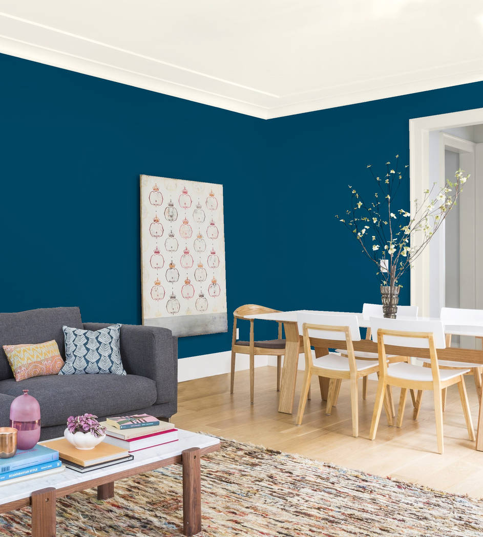
When it comes to blue hues, Villamil much prefers Kelly-Moore Paint’s choice of Peacock Blue.
“I am in love with this color,” she said, describing it as a “lighter blue than maybe a navy blue. It’s a color that makes a statement.” Although it could prove “overpowering” as a full-room color, it would pair well as an accent hue with furniture pieces that “represent Asian cultures and faraway places.”
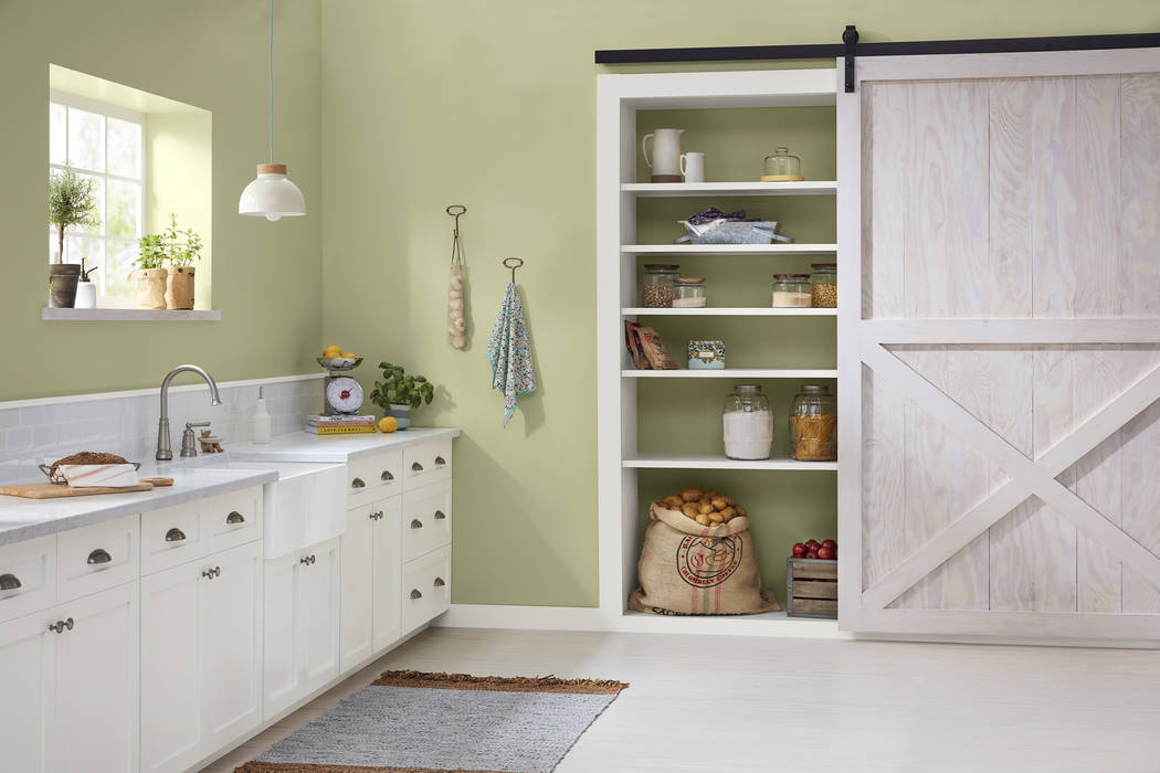
It’s not easy being green — especially if you’re Garden Patch by Dutch Boy.
“1999 called, and they want their paint color back,” Matus said. “I have no real use for this color. … It’s too juvenile. It’s very pastel-like so, unfortunately, it (has) a very dated look. It’s very passe.”
Rachel Skafidas, color and design manager for Dutch Boy, said she selected the “nature-inspired” shade because it displays optimism as well as the “growing empathy” that people are feeling toward one another. “We know that the world is a little bit crazy, but … we hope that there’s better coming forward.”
“It’s weird,” Villamil said of Garden Patch. “It reminds me of a doctor’s office … or maybe a kindergarten” classroom.
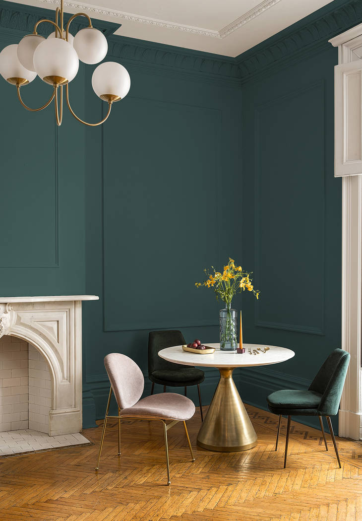
On the other hand, Night Watch by PPG Pittsburgh Paints is a “modern green,” according to Dee Schlotter, the company’s senior color marketing manager. It evokes “the feeling of being deep in nature” and represents “the need for growth and restorativeness in our souls.”
“I see nature, I see peace, I see kind of subtle hints of a calming effect to it,” Matus said. “This is great for maybe a kitchen area — somewhere there’s a lot of busyness — with white cabinets” or a master bathroom “because it’s renewing and … gives you life.”
The color team at Benjamin Moore &Co. opted to tell “a neutral story” for 2019, according to Color and Design Manager Hannah Yeo, and selected a “versatile” gray called Metropolitan that she said is neither age, gender, room nor project specific.
“It’s just your go-to color when you don’t want to do something risky,” Villamil said. She has previously used similar shades “as a backdrop for really beautiful, rich interiors that have a lot of statement pieces or drama because you can (put) pretty much anything against it.”
Not to be outdone, Valspar Paint chose a dozen hues to promote as its colors of the year. Sue Kim, senior color designer for Sherwin-Williams Consumer Brands Group, which distributes Valspar Paints, selected a pair of those colors to discuss for this article.
Martinique Dawn, a light-green hue, represents “how we’re coming back to … what’s within reach of our space, our neighborhood, our community,” she said, using locally sourced foods as an example.
“It looks like (the color of) smokers’ teeth,” Matus said. “It wants to be beige, but it doesn’t. And it wants to be an off-white, but it can’t. … It just seems dirty (and) unkept.”
Kim described the bright shade called Orange Slice as an “action-driven color that really encourages you to do something beyond your comfort zone.”
“It’s terrible. Anybody would be crazy to paint a room this color,” Villamil said. “It looks very Ikea-ish to me. … It’s not something I would use in any of my interiors.”