Here’s what the media is saying about the Golden Knights name, logo and colors
Las Vegas ushered in its first major league sports team on Tuesday night by learning the name and logo for the league’s 31st NHL team.
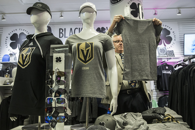
The team is know known as the Vegas Golden Knights. They’ll sport a warrior helmet logo on their uniforms and the team’s colors are steel gray, gold, red and black.
Fans gave their reaction as it was happening — some loved it, some hated, some didn’t care.
Here’s what the media is saying about the name, the logo and the colors:
THE NAME
Barry Petchesky, deadspin.com
“Golden Knights,” however, is bad. Too bland to be respectable, not whimsical enough to be memorable. As a general rule of thumb, adjectives are minor league. “Rays” is so much better than “Devil Rays,” and “Ducks” infinitely preferable to “Mighty Ducks.” Trademark issues obviously stand in the way, but I can see a future where they drop the “Golden” and everyone is better off for it.
Greg Wyshynski, Yahoo! Sports
It’s not even the best variation on “Knights,” which was “Desert Knights,” an immediately memorable and evocation name rather than one you needed permission from the University of Central Florida to borrow.
All things considered, “Vegas Golden Knights” doesn’t suck. Especially because we essentially know that it will follow the lead of the Anaheim Ducks, the Tampa Bay Rays and any number of other teams that foolhardily added a descriptive adjective to their team names and then summarily dropped them later. Hell, they’ve already dispensed with “Las” because it was too wordy.
So it’s going to just be the Vegas Knights as some point, and Vegas Knights is cheeky.
THE LOGO
Paul Lukas, ESPN.com
Overall, it’s hard to imagine anyone claiming that this logo design belongs in the upper echelon of NHL team brands. But it’s the kind of bold, straightforward design that tends to function well as the crest on a hockey jersey. So far, so good.
Greg Wyshynski, Yahoo! Sports
The primary disappointment with the logo is … well, I have no idea why people don’t dig a logo that’s basically Magneto’s helmet run through a precious metals filter.
Barry Petchesky, deadspin.com
The team’s primary helmet logo is fine—the “V” in the negative space is good—even if it is a little reminiscent of the Senators’. The secondary logo, a starburst and swords that evoke the star on the iconic “Welcome to Las Vegas” sign, is a little cheesy but will look better on a shoulder patch than it will across the chest
Kyle Koster, thebiglead.com
Now, as great as the West Point-inspired primary logo is, the secondary one … well … not as great.
Jared Clinton, thehockeynews.com
As for the logo, it’s hard to have any gripes with what is an excellent design and one that doesn’t feel as though it’s going to have any difficulties aging. The logo is sharp, sleek and modern, the colors really stand out and it even has the subtle touches that can turn a good logo into a great one.
THE COLORS
Paul Lukas, ESPN.com
The color scheme — black, steel gray and gold, with white trim — is strong. Red, while not used in the logo, is also listed as an official team color and will presumably be used for accenting, which should work well.
Barry Petchesky, deadspin.com
The team’s colors are steel gray, gold, red, and black, and I want to reserve judgment until we see what the uniforms look like. The description makes them sound…busy.
If done right, I can see a gray sweater working really well. It’s a staid (in a good way) color that doesn’t scream “expansion team.” The trick will be making sure they don’t look like practice jerseys, or alternates. (Here’s what Army’s gray third jerseys look like, and it’s a good base color.)
Jared Clinton, thehockeynews.com
Each color incorporated in the logo was chosen with a meaning in mind, too. Gold, along with being part of the team name, is representative of Nevada’s gold production, the steel grey represents “strength and durability,” the use of red plays on the skyline, desert and canyons in Nevada, and black represents “power and intensity.” It’s hard to compare the color scheme to anything else in the league, especially with the use of steel grey. If nothing else, it can’t be said that Vegas didn’t put thought into each aspect of the scheme.
Follow all of our Vegas Golden Knights updates at reviewjournal.com/nhl and @hockeyinvegas on Twitter.
Contact Kira Terry at kterry@reviewjournal.com or 702-477-3880. Follow @kiraterry on Twitter.
RELATED
Las Vegas' NHL team officially named Vegas Golden Knights

NHL in Vegas
Complete coverage of hockey in Las Vegas
Want to keep up with all the hockey updates? Follow our Twitter: @HockeyinVegas


