‘Just so Vegas:’ How the Knights’ Reverse Retro jersey was designed
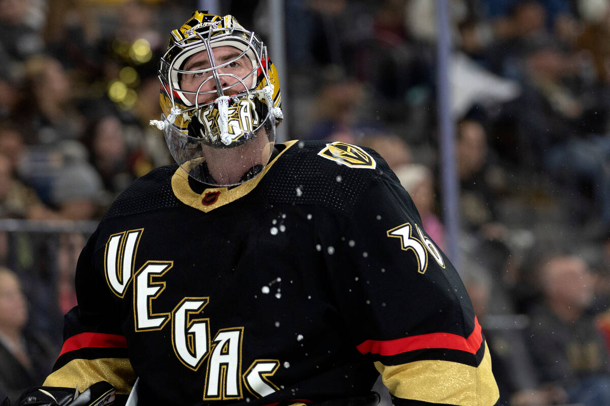
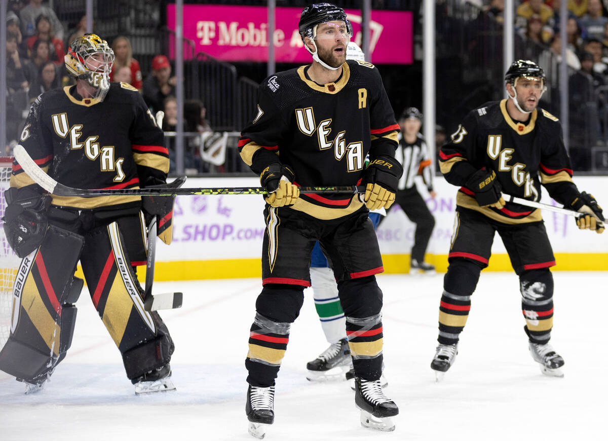
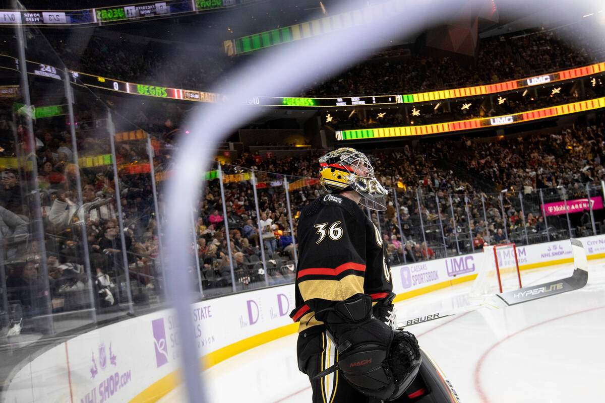


Golden Knights goaltender Logan Thompson was glowing when he walked down the T-Mobile Arena tunnel for a game against the Vancouver Canucks on Nov. 26.
Literally. The crest and numbers of Thompson’s jersey glowed.
It was all part of the Knights’ latest advancement in professional sports marketing and entertainment. The NHL came out with its second batch of Reverse Retro jerseys this season designed to echo parts of each franchise’s history. Many were inspired by old logos or color schemes. Only one glowed in the dark.
The Knights pitched the idea for their jerseys. The folks at adidas hockey are used to the Knights wanting to push the envelope, so it came as no surprise when they asked for something no professional sports team has had before. The results of their work can be seen again during Friday’s game against the Philadelphia Flyers at T-Mobile Arena.
Yup, these jerseys legit glow in the dark. pic.twitter.com/847z0aZOjy
— Ben Gotz (@BenSGotz) November 27, 2022
New intro video and opening fight for Reverse Retro night.
This one was pretty sick. pic.twitter.com/rh55MNZgYu
— Ben Gotz (@BenSGotz) November 27, 2022
“Vegas has been a really interesting pillar of innovation for adidas hockey,” said Dan Near, adidas hockey’s senior director. “They’ve been so open and so creative and maybe not beholden to too much tradition, history or any other limitations that sometimes hold the sport back.”
Adidas hockey, when it was announced that Reverse Retros were coming back for a second time after debuting during the 2021 season, faced challenges. How do you keep a nod to the past fresh?
“Sequels are complicated, right?” Near said.
The Knights’ lack of history almost played in their favor. Their first red Reverse Retro jersey was inspired by the Las Vegas Thunder of the old International Hockey League. Adidas hockey decided not to look back to the city’s hockey past for the second, and instead imagine what a Knights jersey might have looked like in 1995.
“I think when you’re in a town where they have a fake Paris and a fake New York, it’s OK to make a fake historic jersey, too,” adidas hockey design director Matty Merrill said.
The designers chose the year because they thought some of the big, bold graphics and colors from that era fit perfectly with the Knights’ style. They gave the jersey a stair-step crest to represent the vertical signs around Las Vegas.
watch out for me, I'm about to glow 🤩#GlowKnightsGlow | #ReverseRetro pic.twitter.com/NCobDnowoh
— Vegas Golden Knights (@GoldenKnights) November 27, 2022
Bright light city gonna set my soul gonna set my soul on fire 🔥 #GlowKnightsGlow | #ReverseRetro pic.twitter.com/043bAbecbJ
— Vegas Golden Knights (@GoldenKnights) November 27, 2022
Nobody. Does. It. Like. Us.#GlowKnightsGlow | #ReverseRetro pic.twitter.com/PlsrFyTOm9
— Vegas Golden Knights (@GoldenKnights) November 27, 2022
A lot of the inspiration for the sweater’s final look was the result of a “happy accident,” Merrill said. The design team was in Las Vegas for a seven-on-seven football tournament and stopped by the Neon Museum three weeks ahead of their first Reverse Retro meeting with the Knights in April 2021. The group later used what it saw to complete the final look.
The “Vegas” crest on the front of the jersey uses the font of the Excalibur, which opened in 1990. The numbers on the back are from the Stardust.
“Just so Vegas,” left wing Paul Cotter said.
The jersey’s greatest trick was the hardest to pull off. Knights creative director Brady Hackmeister asked adidas to attempt a glow in the dark jersey, hoping the bright glimmer against the sweater’s black base would be a similar image to the lights of Las Vegas shining in the desert.
It’s not the only difficult ask the team has made of the apparel company, which has designed all of its jerseys. The Knights’ gold sweaters are the first metallic uniforms in NHL history. The fabric took adidas about a year to make.
Merrill joked that with the company’s development team, which is responsible for making the designers’ ideas functional, there’s “a little bit of a shudder on that side of the floor” whenever the Knights come up. This time it was taking a glow in the dark concept that can be found in T-shirts and translating it to a professional sports uniform.
Merrill said the key was the crest. Most NHL jerseys have embroidered ones because they need to be durable. The Knights’ Reverse Retro crest is a screen print, so adidas had to add extra layers of protection so it didn’t get damaged.
The first sample was ready by November 2021. Hackmeister said the Knights got a package in the mail, opened it and “sure enough, it can glow in the dark.”
The difficult part from there was waiting to unveil the jerseys to the world. The design was revealed Oct. 20. The jerseys debuted on the ice against Vancouver, complete with a new intro video filmed at the Neon Museum and a fresh pregame fight for the Golden Knight. They’re scheduled to make seven more appearances.
Hackmeister said the reception has been “so positive.” Other teams used the Reverse Retro program to look back at history. The Knights created more of their own.
“Something that we always try to do is keep things innovative here,” Hackmeister said. “Luckily, (adidas was) able to nail it, and it turned out so sick.”
Contact Ben Gotz at bgotz@reviewjournal.com. Follow @BenSGotz on Twitter.
Up next
Who: Golden Knights vs. Flyers
When: 7 p.m. Friday
Where: T-Mobile Arena
TV: AT&T SportsNet
Radio: KKGK (98.9 FM, 1340 AM)
Line: Knights -255; total 6
Knights Reverse Retro calendar
Friday: Philadelphia Flyers
Dec. 17: New York Islanders
Dec. 31: Nashville Predators
Jan. 7: Los Angeles Kings
Jan. 14: Edmonton Oilers
Jan. 16: Dallas Stars
Jan. 21: Washington Capitals