
Raiders iconic helmet logo still acting the part


Editor’s note: This is part of an occasional series acquainting fans with the Raiders’ illustrious 60-year history as the team moves to Las Vegas for the 2020 season.
During his many years as a leading man of Hollywood Westerns, George Randolph Scott often was described as debonair, easygoing and graceful, with a necessary hint of steel.
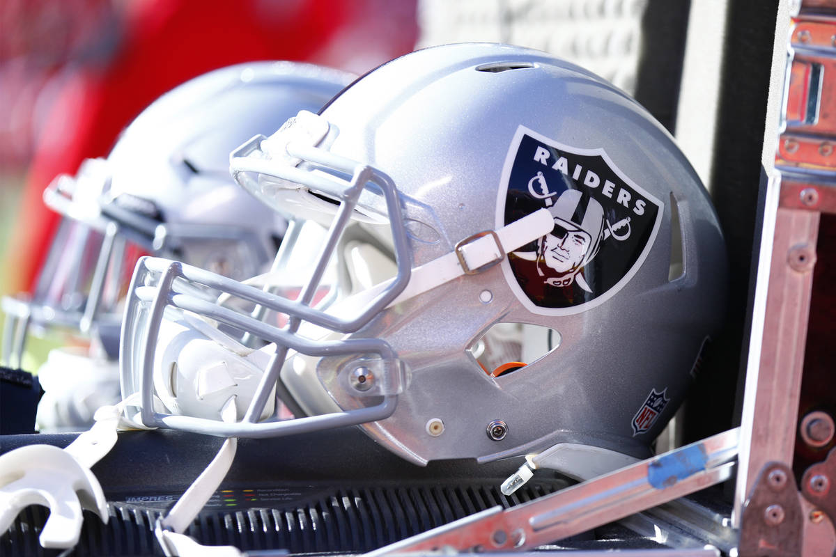
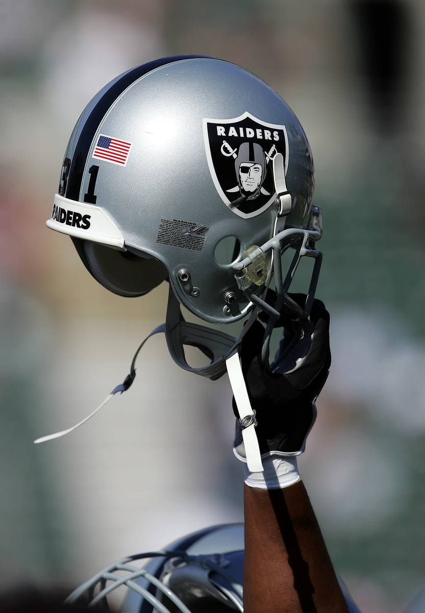
Throw out easygoing, and it’s easy to see why the veteran actor’s face inspired the Raiders’ iconic helmet logo that for 60 years has stood the test of time.
Scott’s last film was “Ride the High Country” in 1962. Directed by Sam Peckinpah and co-starring Joel McCrea, it is generally regarded as a classic. It was released the same year the Raiders finished 1-13 and Gregory Peck won the Oscar for Best Actor for his performance as Atticus Finch in “To Kill a Mockingbird.”
But when the Raiders decided to modify their helmet logo for the 1963 season, they left Randolph Scott’s mug, square jaw and distinctive patch over his eye right where they always have been.
Did you know that square-jawed pirate on the Raiders logo was modeled after actor Randolph Scott? pic.twitter.com/PyVegOaLZ9
— Sam Farmer (@LATimesfarmer) August 3, 2018
Here are five other things about the Raiders’ helmets and uniforms:
1. Although the Raiders are best known for dressing in silver and black, those were not the original colors. From 1960 through ‘62, the team wore black and gold uniforms with white pants.
Everyone thinks of the Raiders as the silver and black. But from 1960-62, their colors were actually *gold* and black. pic.twitter.com/FCciaQy2S0
— Paul Lukas (@UniWatch) January 3, 2017
2. It’s not clear why the black and gold scheme was chosen. According to the 2014 book “The Raiders Encyclopedia,” the team had to scramble to find uniforms after becoming the last American Football League charter franchise and acquired a surplus from the University of Pacific. But UOP’s official colors have been orange and black since 1851, according to the school’s website.
Oh HEEEYYY University of Pacific school colors are orange and black. I NEVER HAVE TO LEAVE MY BELOVED CLASS COLOR !
— Leanne✨ (@leannezzers) September 22, 2010
3. The Raiders did not add player names to the back of their jerseys until midway through their inaugural season of 1960. Then they added both first and last names above the numerals, borrowing an idea pioneered by baseball’s Chicago White Sox during spring training that year.
.@UniWatch pic.twitter.com/UgKppNqdAU
— Phil Hecken (@PhilHecken) January 3, 2017
4. The Raiders wore away jerseys with silver numbers during the 1963, 1964 and 1970 seasons. The metallic ‘63 and ‘64 numerals featured a thick black outline, and both designs remain part of the team’s throwback scheme.
Raiders' white jerseys had silver numbers w/ thick black outlines in 1963-64 (top). Silver numbers returned in 1970 but w/ thinner outlines. pic.twitter.com/MG435D7JmP
— Paul Lukas (@UniWatch) January 3, 2017
Raiders' silver numbers on white jersey have reappeared on throwbacks and Color Rush — sometimes w/ thick black outlines, sometimes w/ thin. pic.twitter.com/8Me10YHn3K
— Paul Lukas (@UniWatch) January 3, 2017
5. Unlike the team’s home base, the helmet logo and colors have remained constant. The background on the original logo was silver instead of black, and the Randolph Scott doppelganger sported a solid black helmet per the Uni Watch website and old photos of running back Clem Daniels.
Logo shield on Raiders' first silver helmet, in 1963, had light background, not solid black. Was revived as a throwback in 1994. pic.twitter.com/i92KS6Lf7J
— Paul Lukas (@UniWatch) December 12, 2016
Contact Ron Kantowski at rkantowski@reviewjournal.com or 702-383-0352. Follow @ronkantowski on Twitter.


